ES 2021 Nameplate Showcase
Written on July 6th, 2022 by D. T. Grimes
The Nameplate Project
This project is a DIS Engrosser’s Script tradition. Students are tasked with penning a nameplate to be “engraved” and hung on the door of their first engrossing studio in a make-believe scenario that encourages each Dreamer to imagine themselves pursuing the pen as a living. The general format, layout, and sizing of each nameplate is established by the directions in the lessons, but students are encouraged to let their individuality and artistry shine through in their selection of a personalized tagline and use of artistic ornamentation (if they see fit!)
Below, you’ll find each nameplate has an image and an abstract that covers a little bit of what each student wen through as they produced this project. My hat goes off to each of these Dreamers. It’s a great feat to show your work publicly, and I am sure that seeing these submissions will be an inspiration to future students for years to come. Excelsior!
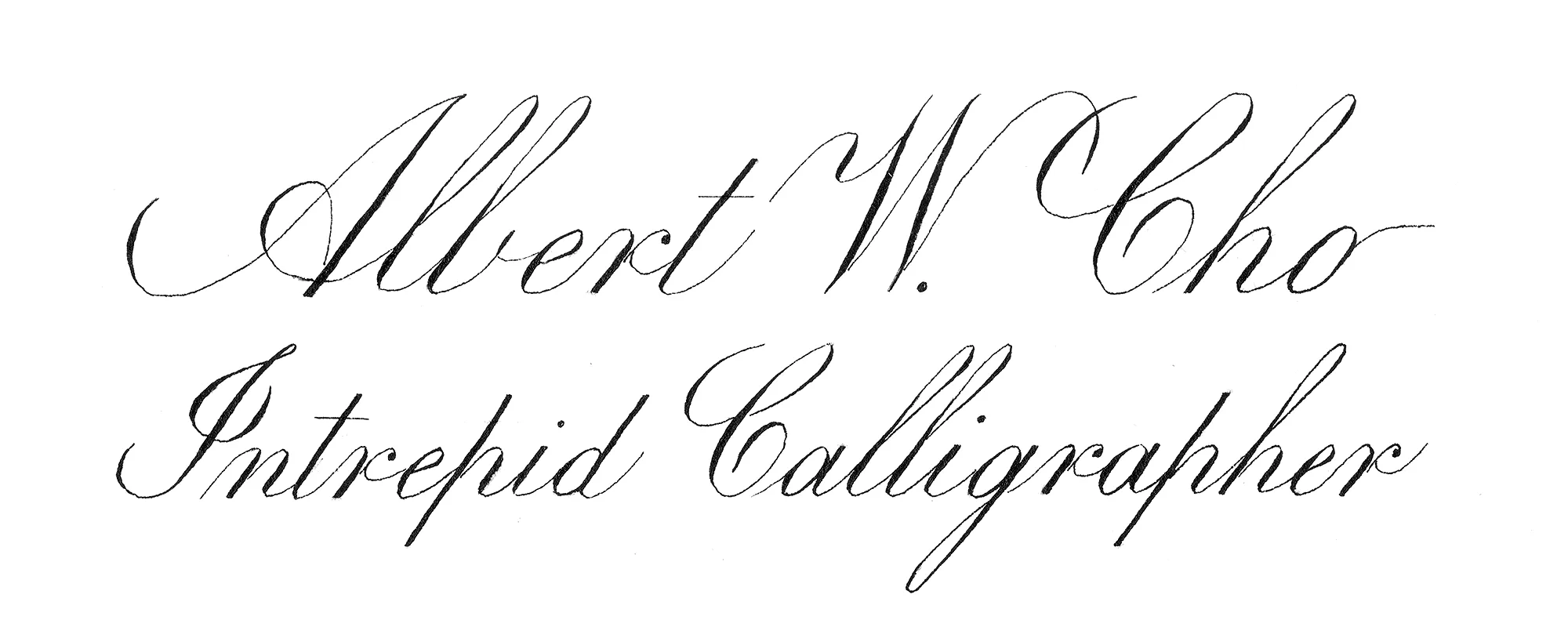
This project was an interesting journey. It started innocently enough, picking out a tagline to envision what calligraphy means to me. Then it became the project where I would be producing calligraphy on watercolor paper, which seemed so much more serious than working on inkjet paper! It was scary, producing a first work of calligraphy that wasn’t just for fun or practice, to purposefully work on one project for weeks on end, draft after draft. But, it was fun to see the adjustments I made over time, and I was pleasantly surprised at how the feedback from my fellow calligraphers, their more objective perspectives, and examples of their work prompted my creativity in new directions.
The project also exposed me to a new medium of sorts the watercolor paper which I loved using; it provided different feedback of pen on paper, which was exciting and refreshing. In the end, the project carried calligraphy to the next level for me, gave it more gravitas. With this first project under my belt, I look forward to seeing where this calligraphy journey takes me next!
Albert Cho – ES 2021 Dreamer
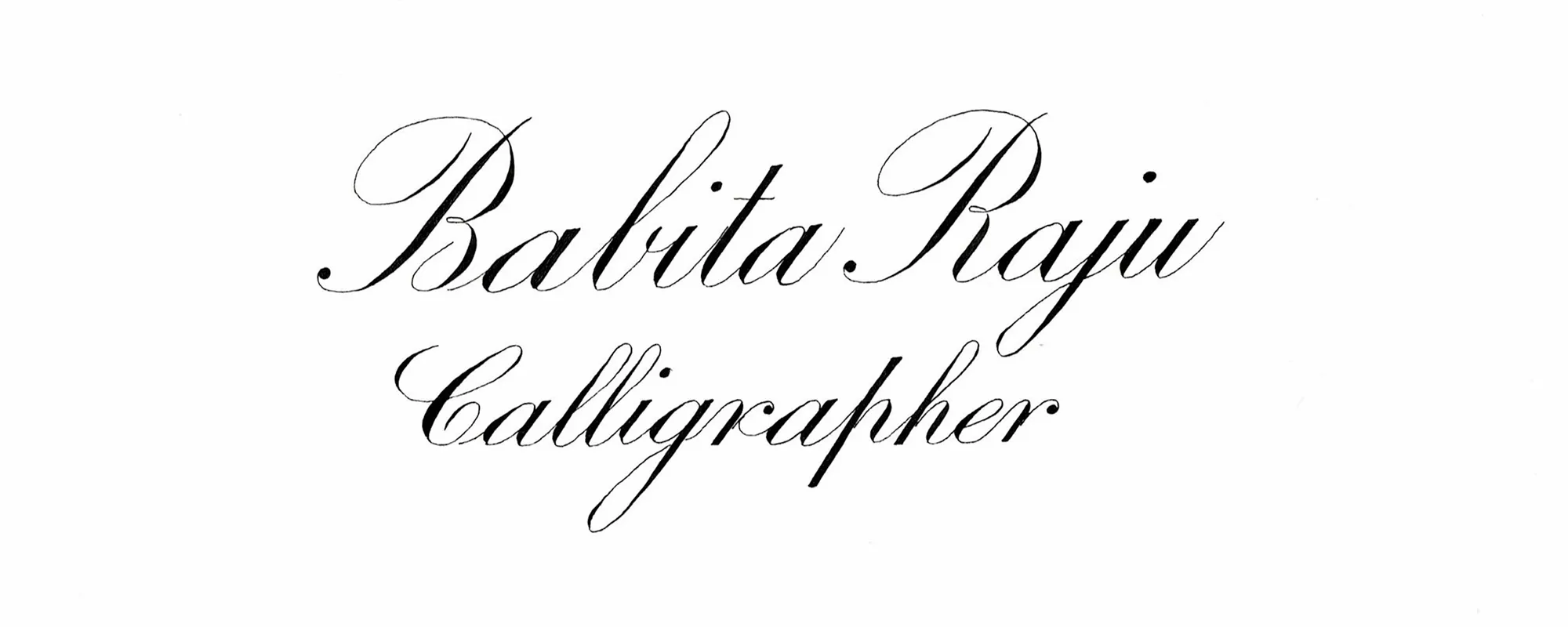
I tried this quite a few times but every time something went wrong. I decided to do a final piece and that would be my final submission. The canopies are not consistent. The three miniscule a’s have different shapes of oval.
The main difficulty I have faced is that while I am practicing most of my letters are consistent but once I start producing a professional work it becomes difficult to retain that consistency. As a beginner, I keep a phrase in my mind ‘Progress over Perfection’. I am really proud of the PS#4 stroke in RAJU.
The journey has been amazing. The community is amazing. My fellow Dreamer keeping practicing, engage in the community try to make friends. It’s good to have someone you can talk to about the principle shades, canopy and DIS. All the best.
Babita Raju – ES 2021 Dreamer
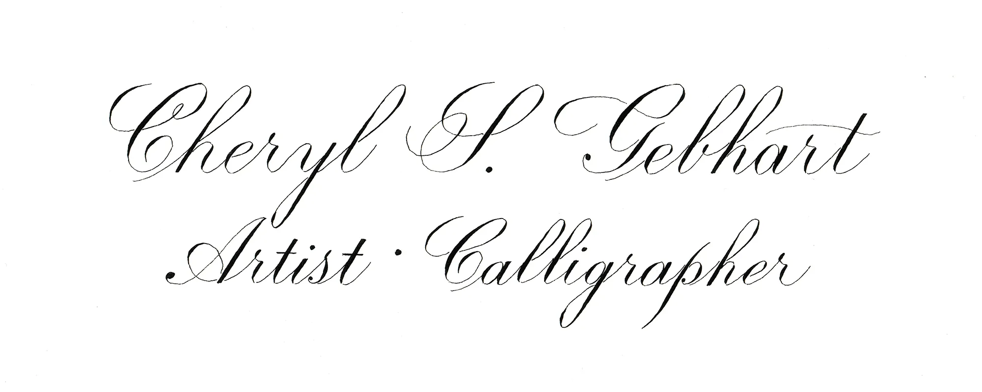
I have enjoyed every part of learning Engrosser’s Script, but the project phase has been my favorite by far. For this first project, I had originally planned to use “Watercolorist * Calligrapher” as my tagline, but after writing it out in pencil, the tagline was longer than my name. I wanted my name to be the main focus, so I changed my tagline to “Artist * Calligrapher”. I also wanted to use some small flourishes in my name to further emphasize it. I searched for historical examples of Engrosser’s Script, as well as a modern Copperplate script, and settled on my style. All that remained was the execution of my design.
After my first draft, David made a suggestion about the spacing of my tagline which I agreed with. It took me a total of four attempts to arrive at my final. My first three drafts all had some shaky lines, so I did more warm ups before starting my fourth, which worked. I was much more relaxed and was able to complete my name plate in a manner that pleased me. I know that continued practice will lead to more improvements, and I’m excited to continue.
Cheryl Gebhart – ES 2021 Dreamer
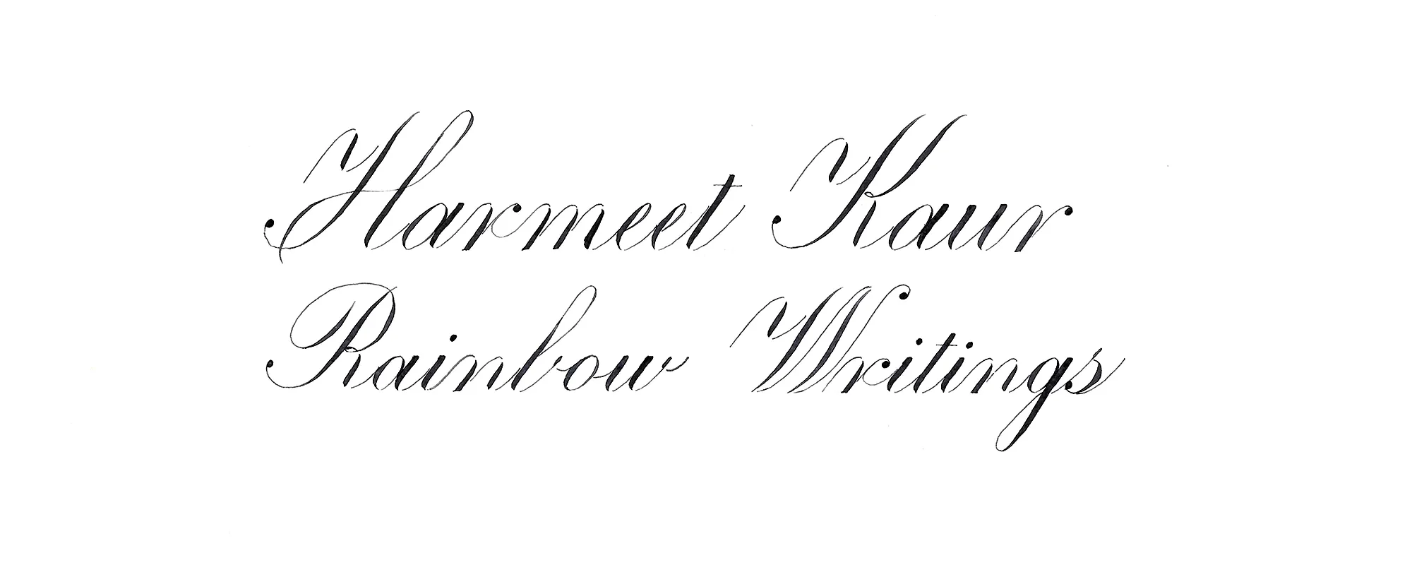
I worked on several nameplates before I sat and penned this one down. I really tried my hand on knife work but mine came out so untidy and for me it’s a long way to finesse. So I have retouched on several places. I have managed to stay on slant lines here. I am happy about this progress. Small steps!!
Harmeet Kaur – ES 2021 Dreamer
The overall lesson I learned was that a project could go on and on with infinite design possibilities, as well as a desire to achieve ‘better’ letterforms and execution. There is always going to be something I want to do better or an error I want to correct on the next version. At some point, I have to call the project “done” and know that I’ve done the best I can at this exact moment in time.
This was the first project I have ever done. I never realized how much preparation went into the process of completing a final piece. The first step was to decide upon what to write for my tagline. I had to decide the message I wanted to convey, both with the words and with the letterforms that I would use. Not as easy as it sounds! Decisions on composition had to be made. Since this piece would include varying x-heights and some overlapping lines, I learned how to measure and draw my own guidelines, as well as how to center pieces on the paper. Rapid drafting with a pencil was a new process for me. I can see where it will be a crucial beginning step in working out the layout of the words and sentences. The centering was particularly difficult at first, since each time I wrote the script I was not entirely consistent with my letter and word spacing. I was not used to writing at 8mm x-height, so it took practice to become consistent with the spacing at that x-height. I can see where I will be able to manipulate how the text looks by altering the width of the letters and their connections.
I practiced quite a bit with ink on practice paper. At first, I tried adding embellishments to the majuscules, but quickly realized I had no idea how to draw them consistently. So, I went back to the basics for my first ink draft on project paper. When I moved on to the project paper it took me several attempts due to errors such as leaving out a letter and starting a word on the wrong line. I learned to slow down between each letter to make sure I knew ‘the plan’ for the next letter. In preparation for the final piece, I started practicing making minor embellishments to the majuscules. I wanted to prove to myself that I could take a step beyond what I had learned, while maintaining the integrity, balance and composition of the letterforms, words, and overall piece. I am pleased with how much I learned and how this project turned out!
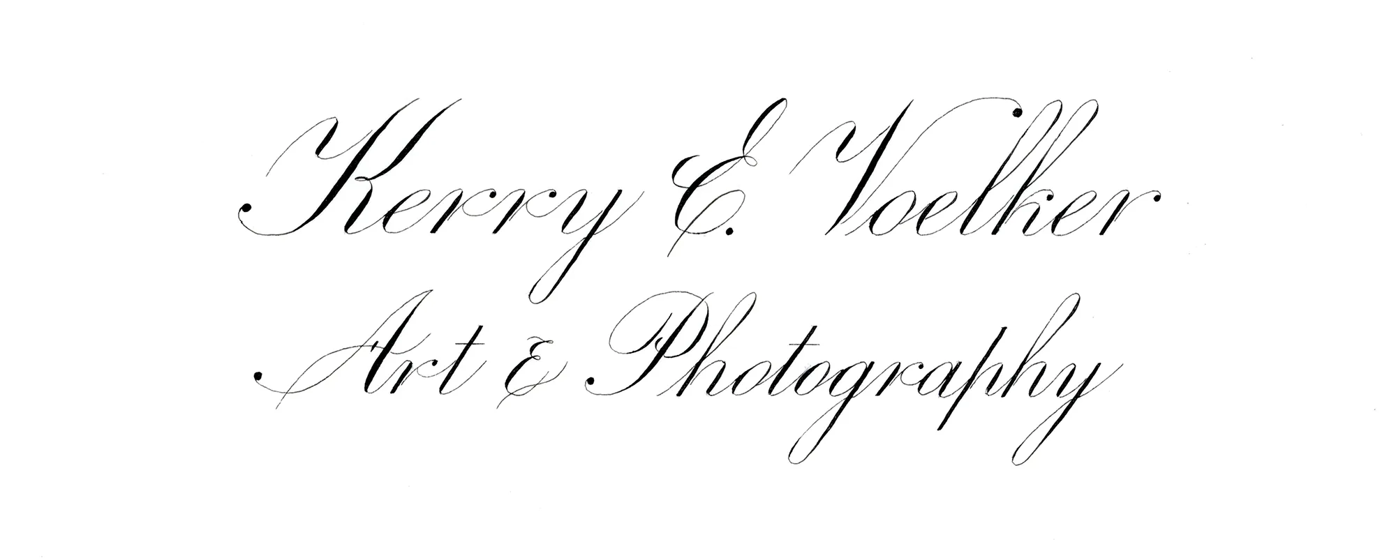
Kerry Voelker – ES 2021 Dreamer
Through several iterations of creating this nameplate (pencil draft, first draft, final version), I made several adjustments. Originally, the tagline was much longer. It seemed out of balance with my name so I shortened it to just the essence of what I wanted on the tagline. I ended up adding a small amount of vertical spacing between my name and tagline after looking at some of the drafts and determining it seemed too compressed. I used some simple flourishing to the capital letters, but kept it to a minimum. The flourish on the capital ‘B’ was partially done to reduce the vacant space between my name and tagline. The one descender I have in my name (‘f’) was in close proximity with the capital ‘S’ in ‘Script’. At the suggestion of David, I changed it to a historical version of ‘f’, which complemented rather than conflicted with the Direct Almond of the ‘S’.
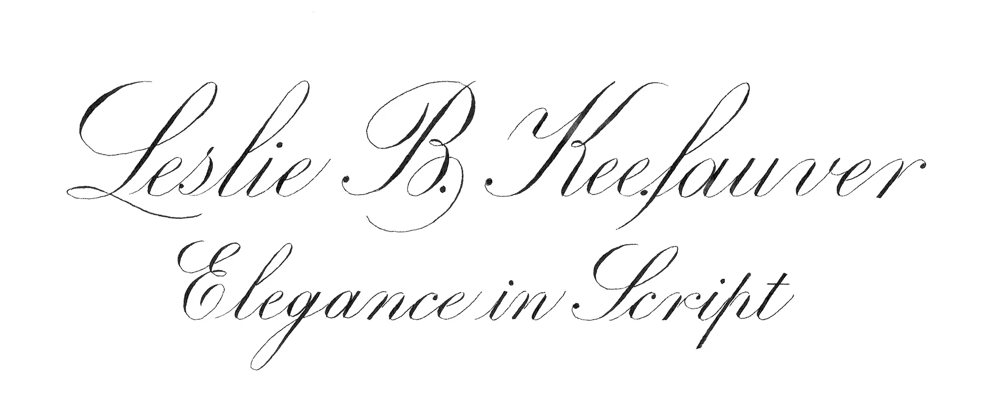
Leslie Keefauver – ES 2021 Dreamer
This Nameplate was my eighth version on Arches Hot Press Paper and probably my 40th sample after practicing and refining ascending loops and Majuscules M, K, R.
I learned I am still drawing too many lines and erasing around writing and fine hairlines risks erasing them as well! I also learned that having multiple pre-lined pieces of paper makes it much easier to re-ink a project when needed!
Retouching on my Final Draft Nameplate consisted of repairing the hairline near the TERM on the Majuscule R (which was so fine it was erased with my kneaded eraser) and removing five very small ink spatters that occurred underneath the Majuscule K and underneath the last s in Engrosser.
I did practice retouching on several of my seven previous nameplates on the hot pressed paper to get a feel for retouching and to see what could and could not be done. A light hand is definitely needed. It is not as enjoyable as Engrosser’s Script.
Completing and submitting this Final Nameplate Draft made me accept where I am at in Engrosser’s Script. My goal was to produce a simple, classic nameplate in Engrosser’s Script and I achieved that goal.
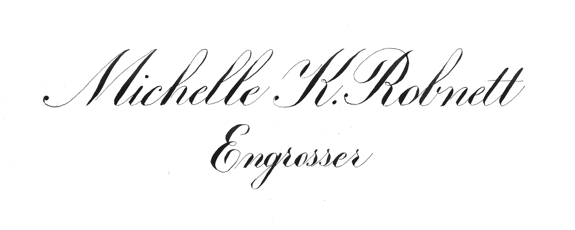
Michelle Robnett – ES 2021 Dreamer
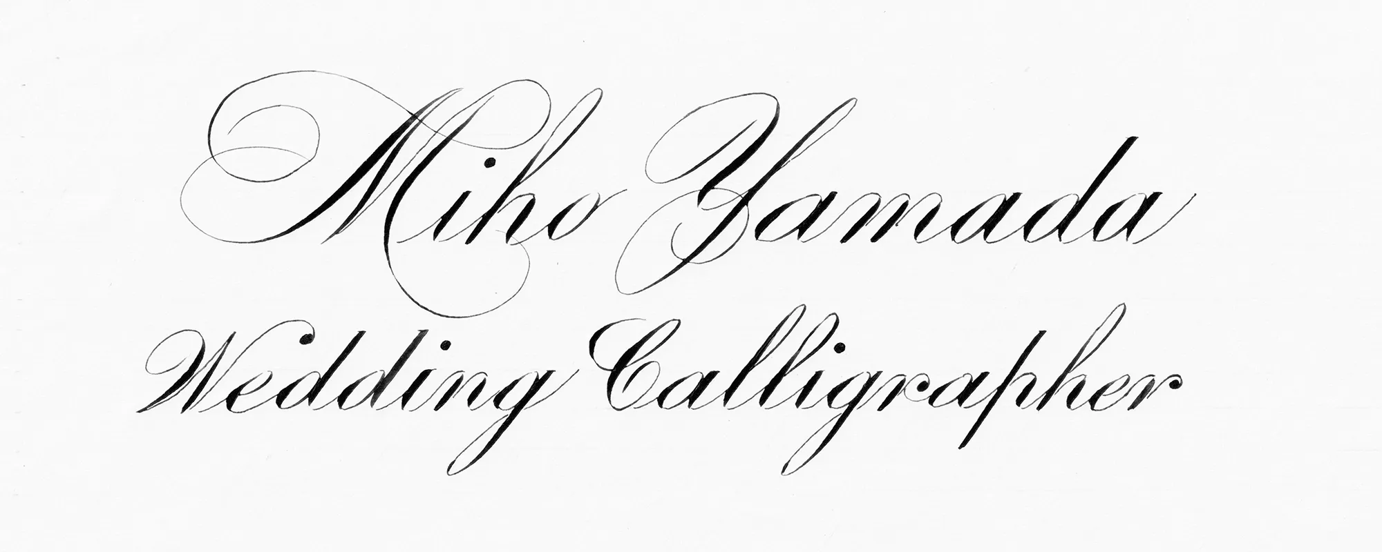
A weddings is an event that blends tradition with the latest fashions, so to make it look as elegant as it is, my M, Y, and W are slightly flourished.
Miho Yamada – ES 2021 Dreamer
First of all I want to thank you David for your teachings. I never really thought having to learn from you will hit me to the core deeply. Thank you!
The truth is, I was not so sure how to correct the hairlines connecting to the PS. I do not have a cover glue or something to use. I think I did better in the 1st draft than the final if I am to compare them without correction. But reading from you talking about how to not get obsessed about it and take it as a learning process… that gives me a relief. I added a bit of flourishing to my double z’s and the r of my names to balance out the weight of the letters. After doing the flourished r, I was a bit sad that I made it too big. My pencil draft was better for sure.
As a conclusion, I did well and know better in the future.
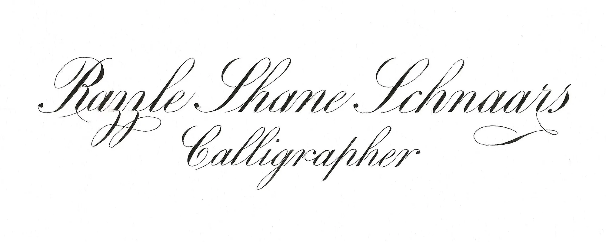
Razzle Schnaars – ES 2021 Dreamer