The 2024 Oregon State Fair Calligraphy Competition
Written on September 4th, 2024 by D. T. Grimes
Each year, the Oregon State Fair holds a calligraphy competition that accepts submissions from all Oregon residents. There are several divisions to choose from when entering: Intermediate-Advanced Adult, Beginner Adult, Student, and a special Oregon category. Entries must have been created within the last two years and cannot have been submitted to the competition in the past. There are a few other rules, but it’s all pretty straightforward.
Over the years, I have been encouraged by friends and colleagues to submit a piece, but it just never seemed to work out with my summer schedule. This year, as the fair was quickly approaching, I decided to throw my hat in the ring. I am so glad that I did. Not only did I learn a lot about my creativity while under pressure, I also got to come face to face with my competitive side. I learned a lot about myself through this process, and I would really recommend it to anyone who has a similar opportunity.
Before I get into the calligraphy stuff, I just want to say that this was the first State Fair that I’d ever been to. I had a great time. There is a big portion of the fair dedicated to carnival rides (which aren’t my thing) but there are also games, crafts, trinkets, dance performances, races, petting zoos, clubs, musicians, beekeepers, blacksmiths, and TONS of food (which I was too busy eating to take pictures of.)
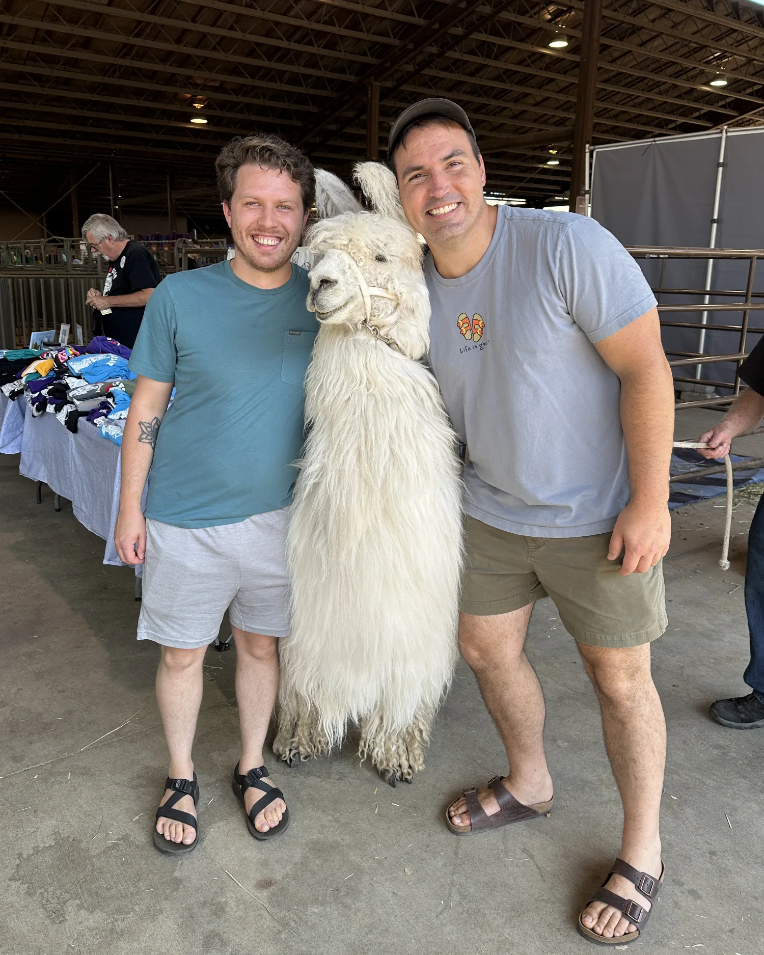
One of my favorite photos of the day was this one of my friend Sean and I posed alongside Caesar the No Drama Llama. This shot kinda sums up the whole day that I actually attended the fair to see what all the hubbub was about.
The calligraphy exhibit is under the umbrella of “Visual Arts,” so it was housed in the same building as painting, photography, and the like. The Intermediate/Advanced Adult division had 38 entries, by my count. They ranged in size, style, subject matter, and complexity. The contest itself is judged by two experienced calligraphers who review the anonymized work and make their rankings based on a number of things, I imagine. I’m not sure of the exact criteria for a winning piece, but I could see what they were going for based on their decisions. Part of why I am writing this article is to give YOU an idea of what you might need to submit next year to win a ribbon. I found it hard to get eyes on past winners while researching the contest.
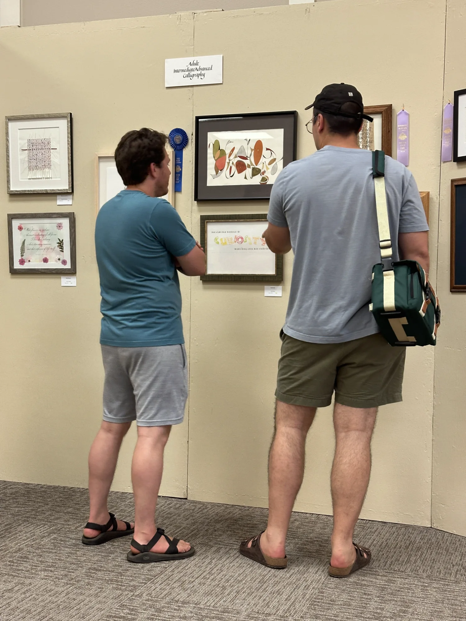
The work is arranged in the exhibit space by volunteers from the Capital Calligraphers. As you can see above, there is somewhat limited space in the exhibition hall, so the pieces can be a bit closer together than they would in a gallery setting. My observation is that larger pieces are afforded more margin around them. For example, one large piece received its own wall panel where four pieces share a panel in the image above. Of course, framing costs rise as a piece increases in dimension, but I do plan to submit a larger specimen next year to have a chance at more breathing room.
The actual building is nicely air conditioned and there were a few dozen people milling around discussing the artwork. Two volunteers from the Salem guild sat by the door writing people’s names on strips of paper. I had mine written in Engrosser’s Script by a gentleman named Rick. Several benches fill the center of the room to sit and ponder as you take in the spread of colors and techniques used in the various mediums. The tone of the room wasn’t hushed, as you might expect in a museum or art gallery. People chatted freely and easily. Children tugged on the hands of their parents, pulling them to the next interesting thing. An air of familiarity and comfort filled the space.
I didn’t take photographs of every entry, but below are the winning entries from this year’s Intermediate/Advanced Adult contest. I hope it’s helpful to you and inspires you to consider submitting to the Oregon State Fair (or another calligraphy contest) in the future.
Best of Show — Judy Black
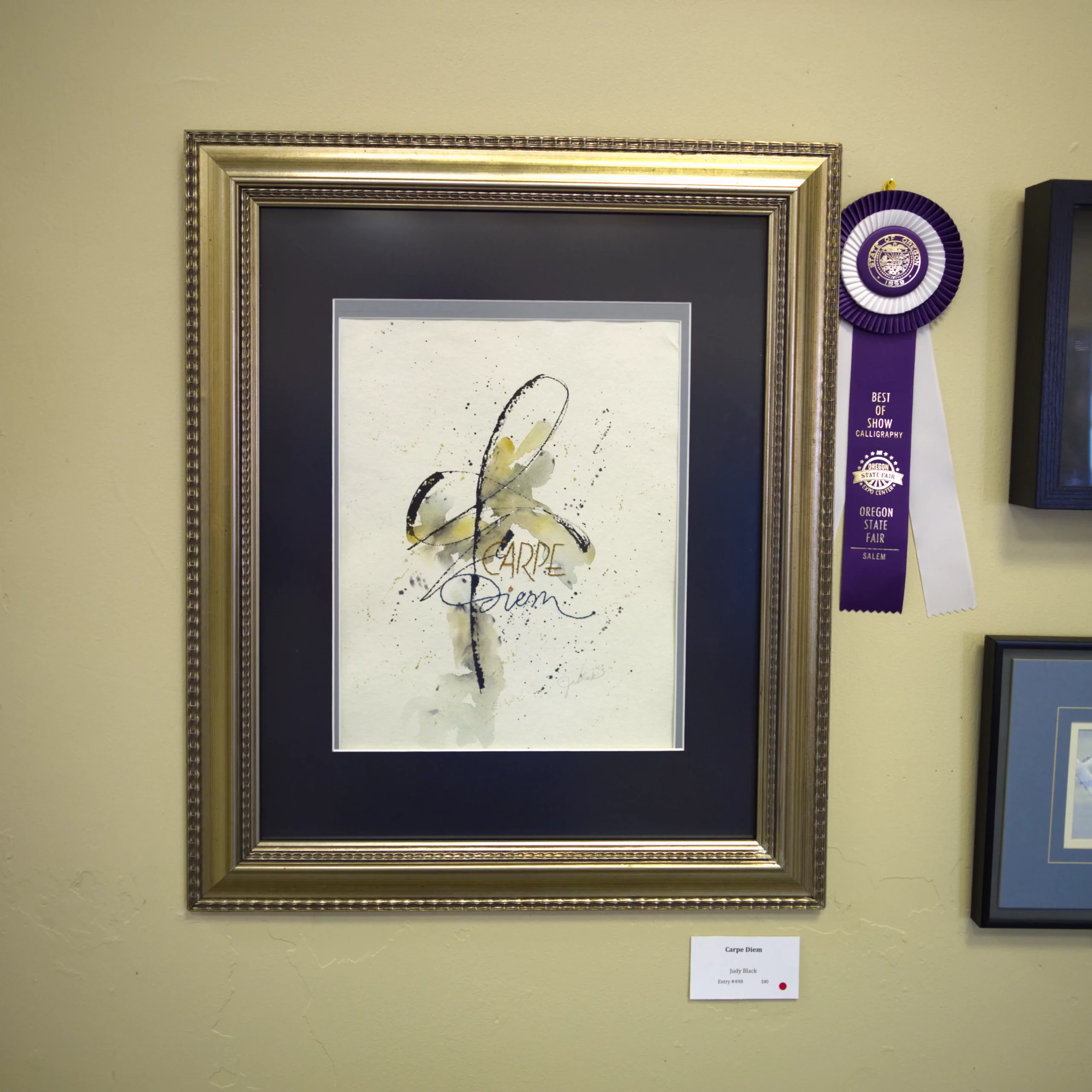
This piece, titled “Carpe Diem,” and awarded Best of Show, was created by Judy Black. The expressive black strokes evoke a sense of freedom and chaos, while the carefully stitched “Carpe Diem” offers structure and consideration against the watercolor and splatter background. Yes, “stitched.” The lettering is sewn into the paper. Quite creative! I liked the colors of this piece. The photograph does not do it justice due to the exhibit lighting.
Blue Ribbon (1st) — Amy Bennett
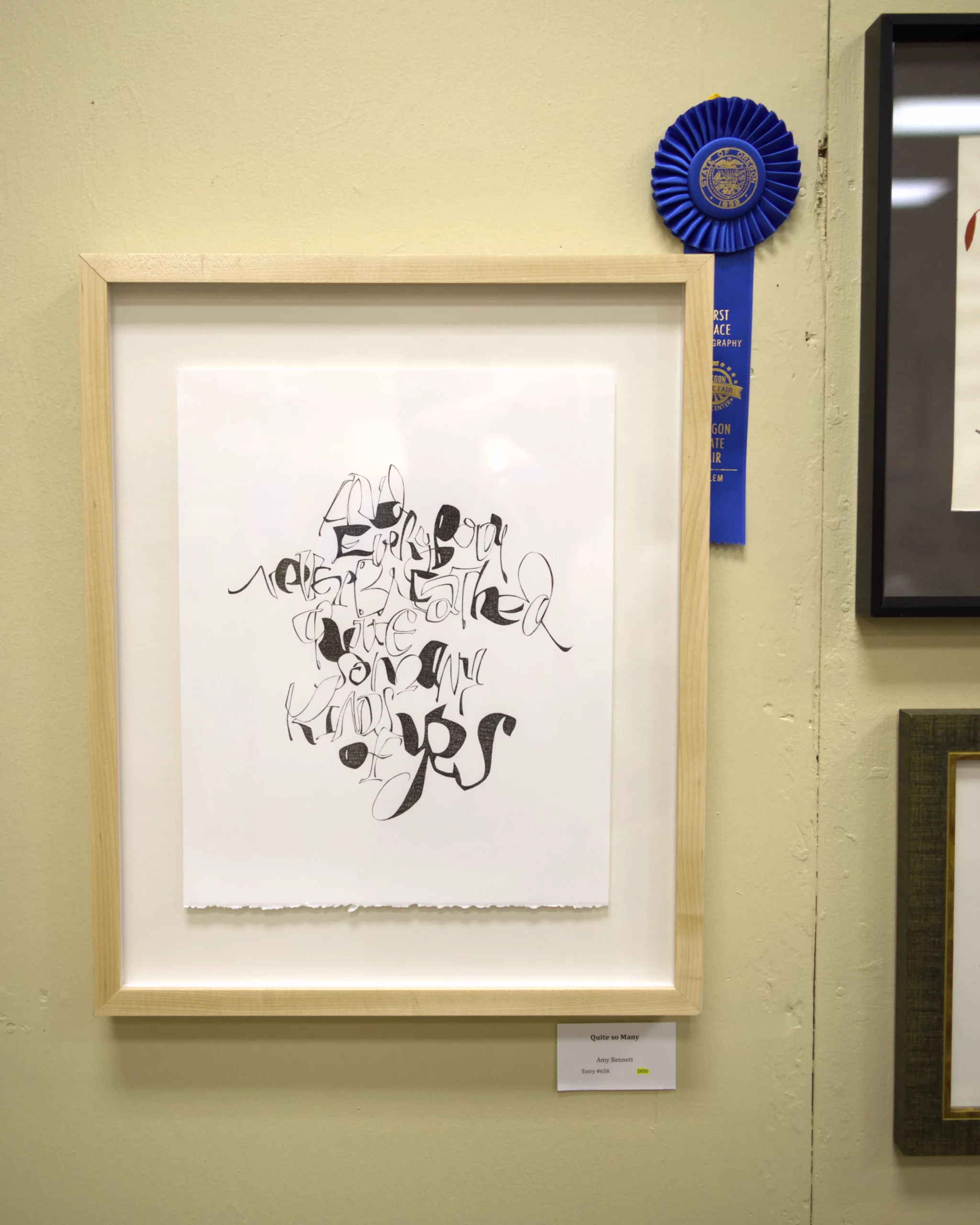
This piece, titled “Quite So Many,” and winning the Blue Ribbon in first place, was created by Amy Bennett. It reads, “And everybody never breathed quite so many kinds of yes,” an excerpt from the poem “Sweet Spring” by E. E. Cummings. The lettering here is clever as well. Although this piece was not immediately legible to my eye, there are some very calligraphic shapes happening throughout. I was surprised upon closer inspection to observe that the shades are, by my estimation, built up. That means that the calligraphic swash, turn, and twist have been so internalized by Bennett that she is capable of rendering them outside of the natural confines of the pen. A feat, to say the least.
Red Ribbon (2nd) — Margaret Hespen
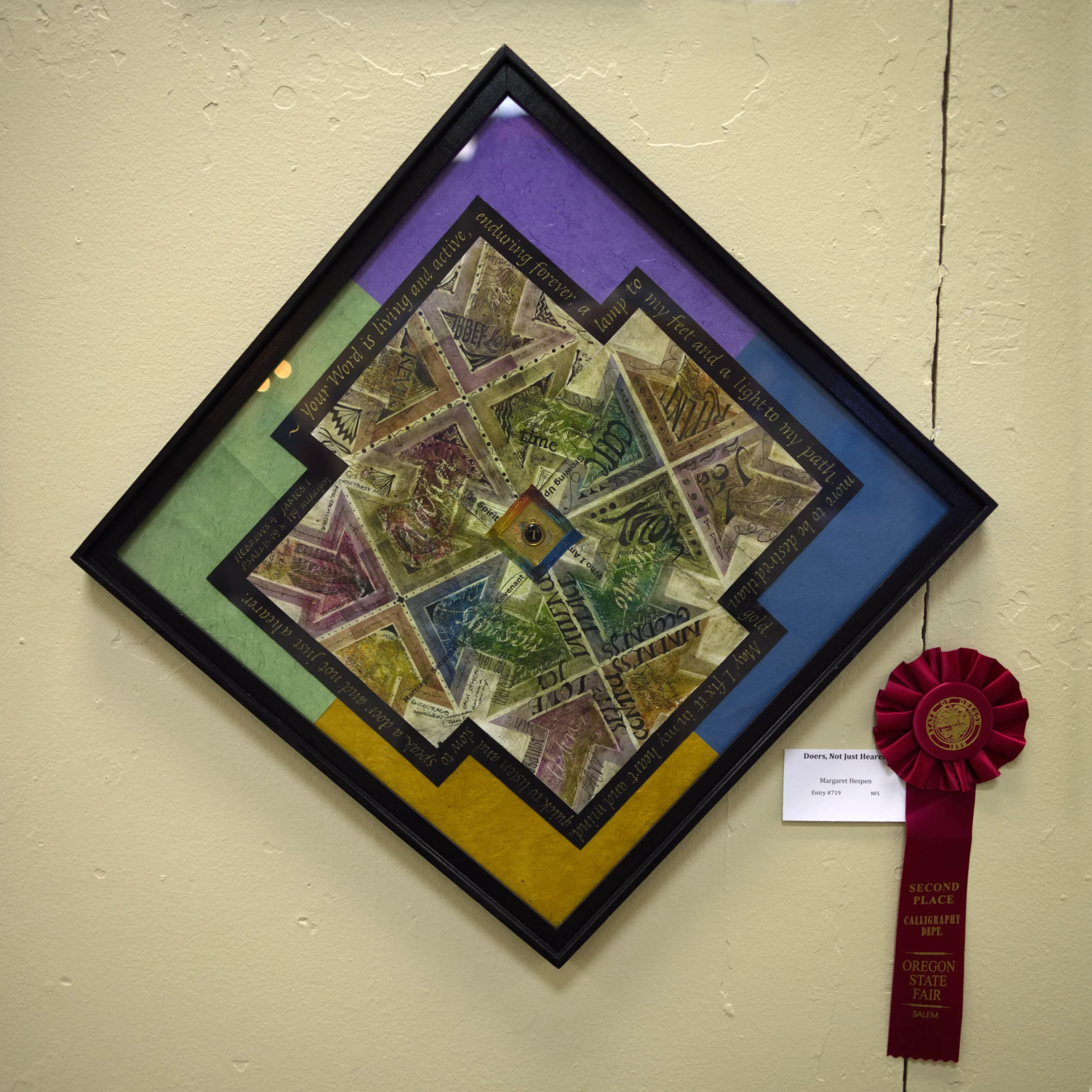
This piece, titled “Doers, Not Just Hearers,” and winning the Red Ribbon in second place, was created by Margaret Hespen. It is a collection of Bible verses scribed around the exterior of a beautiful, colorful set of illustrations and lettering treatments. It hung at an angle, ensuring that it was a one-of-a-kind specimen in the show and preventing any specific verse from being completely upside down or right side up. I found this to be a good solution to writing around a shape. The colorful background and textural layering of each component create a very pleasing effect.
White Ribbon (3rd) — David Grimes
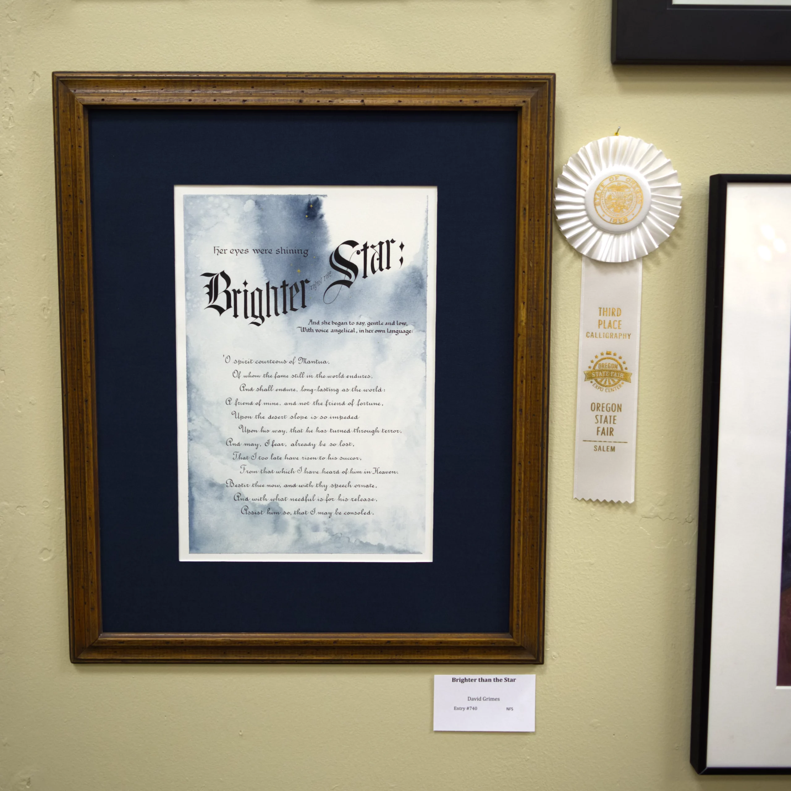
This piece was my submission, titled “Brighter than the Star.” It won the White Ribbon in third place. It is a selection from Canto II of Dante’s Inferno. I’ve always been moved by the language of this scene where the spirit of Beatrice comes down from heaven and petitions Virgil to assist her beloved Dante. I wanted to employ a watercolor wash in a way that felt like the shroud of the heavens opening, hence, the unadulterated white bloom in the top-right corner surrounded by tiny golden stars.
The body of the text, written in French Roundhand, sits just above 2mm in x-height. That’s quite small for me, but I wanted to push myself to do a longer piece within the dimensions that I had declared when registering for the fair. I was quite happy with the marriage of the various hands that I employed, and I definitely plan to incorporate some of the lessons learned into future works.
A huge thank you to the Capital Calligraphers and esteemed judges for their hard work on this event. Congratulations to all of the other ribbon winners, Honorable Mentions, and competitors. I hope to see you all next year at the 2025 Oregon State Fair Calligraphy Competition with a new submission and, the fates willing, another ribbon!