ES 2022 Nameplate Showcase
Written on October 12th, 2023 by D. T. Grimes
The Nameplate Project
In a continuation of the DIS Tradition, these DIS Engrosser’s Script students were tasked with penning a nameplate to be “engraved” and hung on the door of their first engrossing studio in a make-believe scenario that encourages each Dreamer to imagine themselves pursuing the pen as a living. The general format, layout, and sizing of each nameplate is established by the directions in the lessons, but students are encouraged to let their individuality and artistry shine through in their selection of a personalized tagline and use of artistic ornamentation (if they see fit!)
Below, you’ll find each nameplate has an image and an abstract written by each student. I look forward to seeing these nameplates each year, and I deeply appreciate each student that applies to this exhibition. Without further delay, it is my honor to present the following specimens.
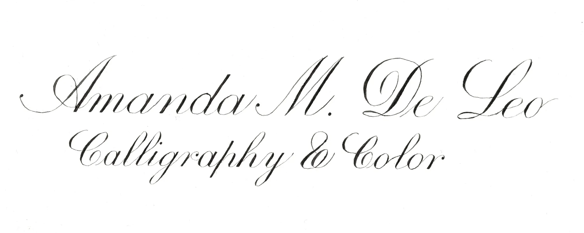
“This project has been exciting, finally putting together all the techniques and countless hours of practice into a beautiful nameplate. I have really enjoyed this work. Even though I have made some pretty silly mistakes, working with fine arches paper and all of the amazing Dreaming in Script methods has resulted in something I am proud of and super excited about. I love acknowledging that it can get better and better as I practice and study. What a wonderful art engrosser’s script is! Thank you for teaching us, David! This style of learning (DIS) and working with others (community forum) is what I’ve been searching for for years!”
Amanda De Leo – ES 2022 Dreamer
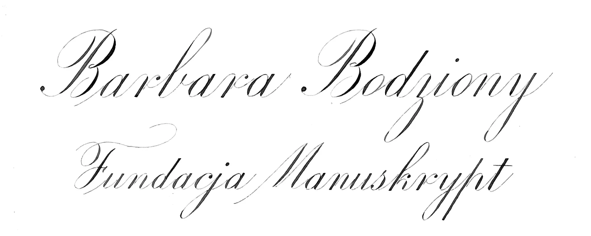
“I was very happy to do this project. David gave us a challenge that has confronted us with so many issues. A choice of words, a difficulty to write bigger letter forms on a different paper, words spacing, composition dilemma. After many months of constant studying letter forms, we were put before something new. I chose for my project the name of my new adventure – a foundation I started, so something that was of a great importance to me.
The biggest challenge was finally the paper. I did struggle with it, especially when it came to thin lines. Having two of the same majuscules in the same line was tricky, because they didn’t want to look like they were from the same family. After some frustrating time I’ve ended up with these two, that I’m proud of. I gave something extra to my majuscule F as my foundation is about art & creativity.
The great fun in this project was to see what I’m capable of. I know how many hours I had spent of practicing every letter. To see them together gave a real sensation of pride and joy. I know that I have a long way to go, and that is the most exciting in Engrosser’s Script. So much to learn, so much to know, to discover, to write! Thank you David & all my fellow students!”
Barbara Bodziony – ES 2022 Dreamer
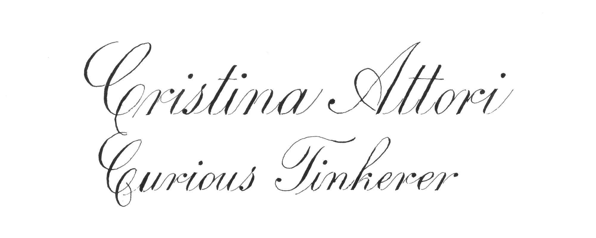
“The thing that was more problematic to me was the two beginning Cs. I tried to look for some variations but also having them too different wasn’t really too convincing. In the end I opted for joining them together, I am not fully satisfied, probably the second C should be moved further right to balance better.
The piece has tons of other defects, but my major success was to tackle the project, from the pencil sketch, to the layout to the final result. Before this course I wouldn’t have thought of doing anything more than single letters!
This course was really demanding in term of dedicated time and effort, but I deeply enjoy the depth of the information that was given to us: no topic was too humble or too small!”
Christina Attori – ES 2022 Dreamer
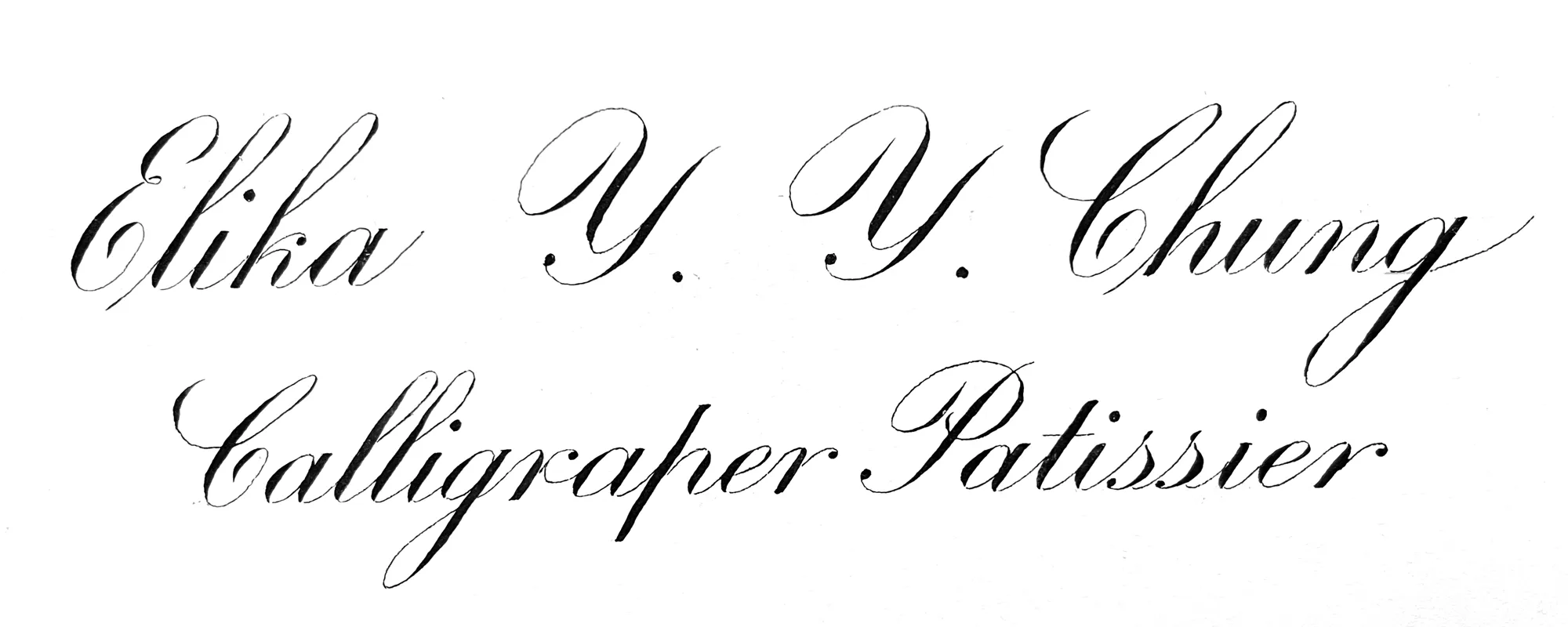
“I have tried 4th times for this after the 1st draft. This project was more difficult than I thought. Because of my inconsistent handwriting, I found it very difficult to control the position of each draft. Even if I started at the same point, I could end earlier than I thought which meant my word were narrower than before. This inconsistency make me very difficult to make the final nameplate in a balanced style.
Luckily, my 4th draft was better after I cut out some white space in the left of the paper and it became 22cm wide . At least both lines look centred relatively to each other. There are also a lot of impovement I could do to my letterforms but I am quite satisfied with both Ys in my first line.”
Elika Chung – ES 2022 Dreamer
“The nameplate project was a calligraphic challenge unlike any other so far in my penmanship journey. Until this point, I only worked on hobby projects and practice. Putting down my name and a tagline on watercolor paper felt more serious than my previous writing, and it is a snapshot of my skill as a calligrapher at this point in time. On one hand, it is a vast improvement from before Dreaming in Script, but I will also look back on it later noticing several things I could do better.
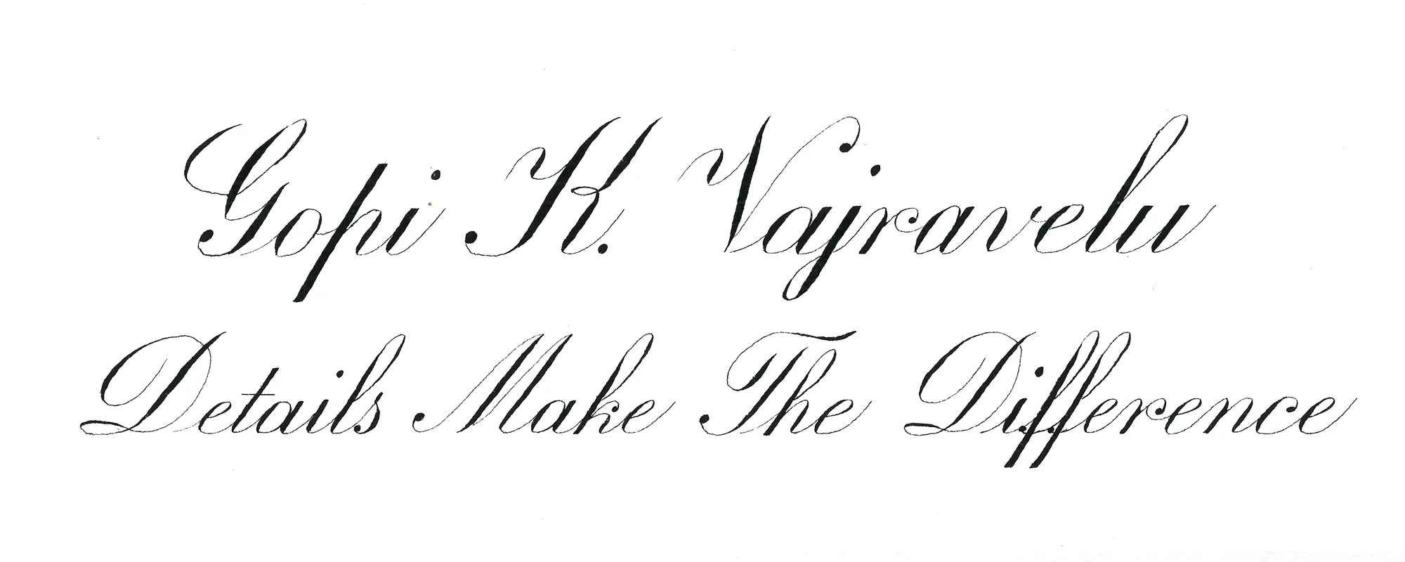
I chose the tagline “Details Make The Difference” because so many elements of Dreaming in Script remind me of my design and engineering background where details also make the difference between a successful and a failed project. I did not use any flourishes to keep the nameplate formal and serious. The minuscule ‘j’ in my last name is shortened for vertical balance between my name and the tagline.
I learned so much during this nameplate project such as drafting, layout, and retouching. All of these are valuable skills for future projects. The nameplate project pushed me outside of my comfort zone and I am a happy with the result.”
Gopi Vajravelu – ES 2022 Dreamer
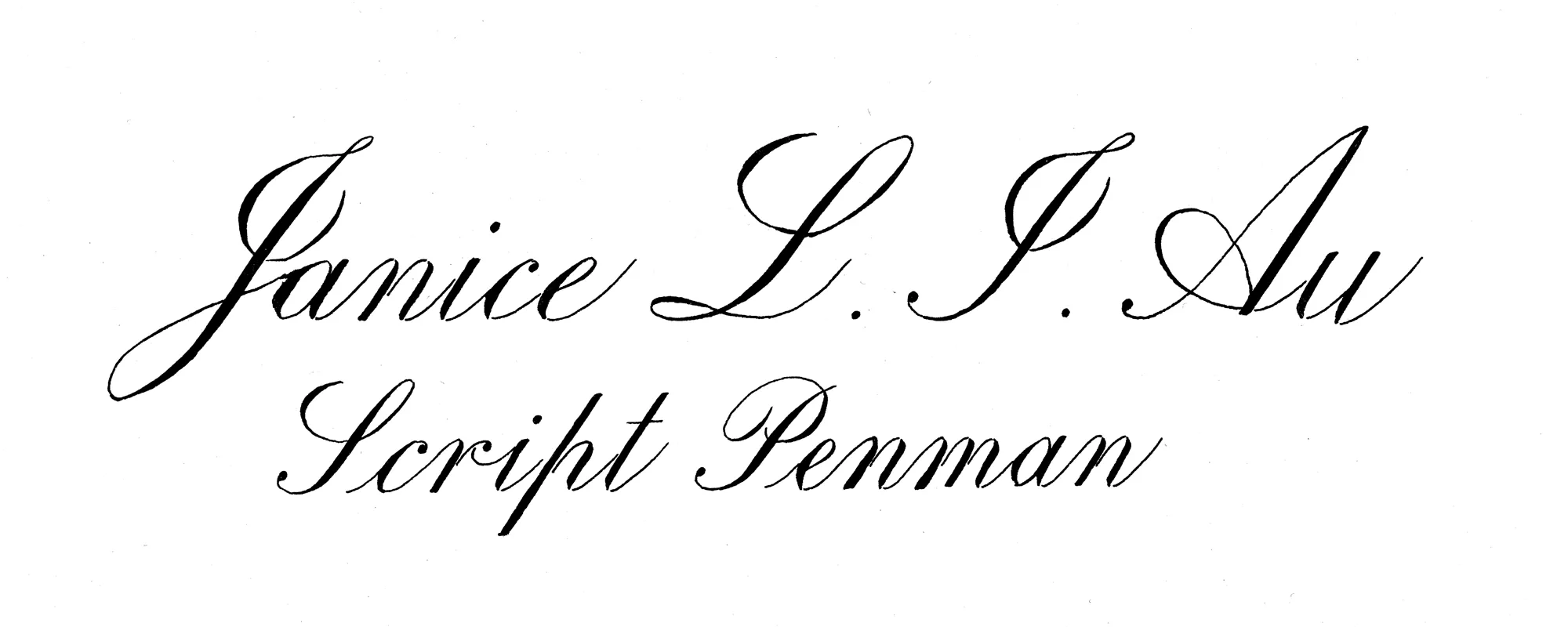
“I enjoyed learning in this course. My most favourite part is this nameplate project.
For this nameplate , various writing skills learn from this course have been used; the essential quality of minuscule and Majuscule, the interval spacing, the center of layout. I need to plan and execute carefully to finish this job.
After writing, I still need to examine the area need to be modified. Retouch skill and knife work were used in order to present the best.
David is really a specialist in script. He is not only specialist in writing but also in teaching. He takes me to an advance level, which lead me the direction to be a professional penman. I am so glad that I took this course.”
Janice Au – ES 2022 Dreamer
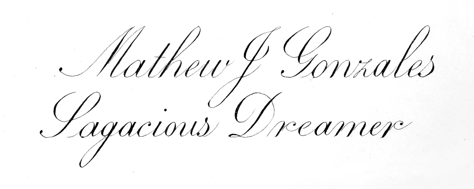
“This final draft was completed on Stonehenge Aqua 140# paper with a Leonardt Principal nib. Black Sumi stick ink was ground and deluded with Moon Palace Sumi. This Stonehenge paper was not my original choice but after several failed versions, switching was necessary. Paper was ruled at 8mm for my name and 6mm for my tag-line. I only attempted to re-touch a few areas. I found that I was doing more harm than good and eventually abandoned it. In conclusion, I am not 100% satisfied with this version. There are several areas that I find problematic and would prefer to start over.”
Mathew Gonzales – ES 2022 Dreamer
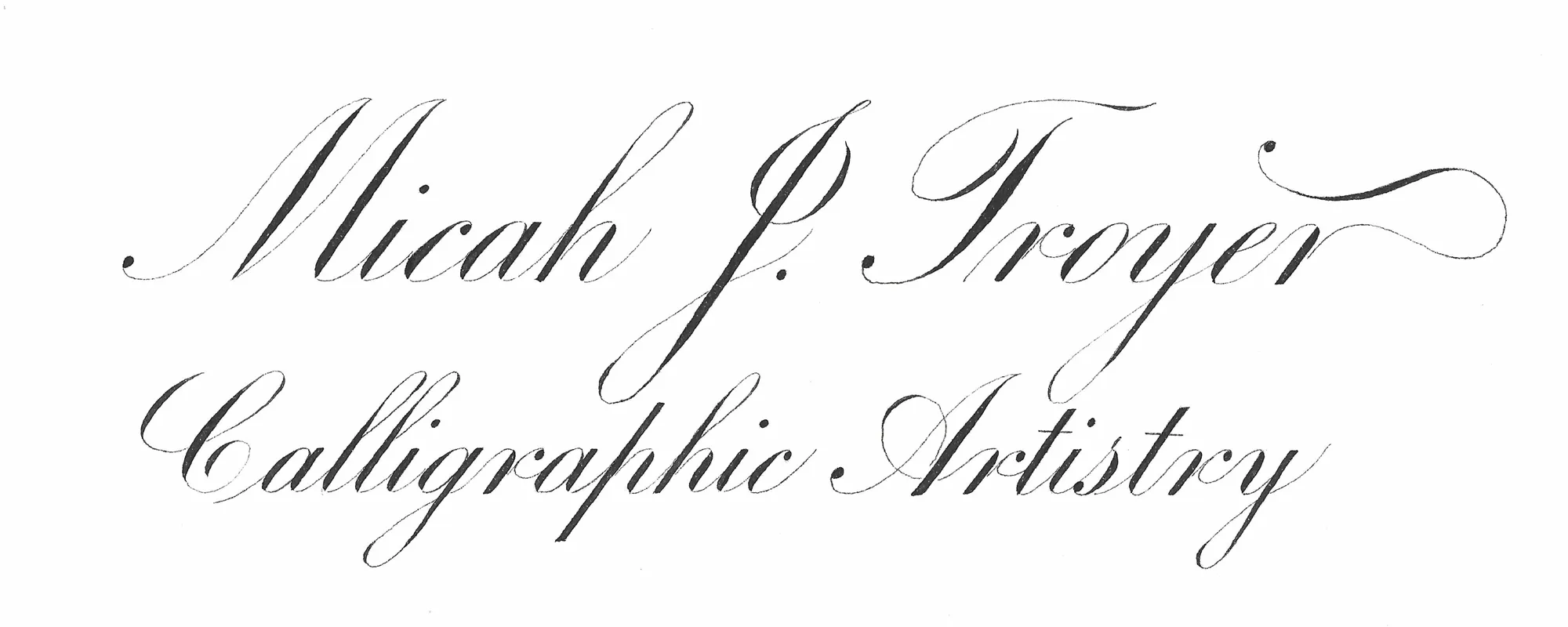
“This project has been an amazing learning experience for me. Not only have I learned a variety of skills related to designing, planning, and executing a calligraphy project, I have also had time to think about some the mental aspects of calligraphy. It’s easy to be relaxed and easy-minded when I’m practicing. If I make a mistake, it’s not a big deal, it’s just practice! Something happens when I sit down to do an actual calligraphy project. Suddenly, the pressure is on! I begin to engage in negative self-talk. I think things like: “Oh boy…Here comes that letter I struggle with”, or “you’ve already messed up”, or “is this going to be the stroke that ruins this piece?”. When I think these things, I begin to tense up and the quality of my writing suffers.
Something that really helped me in completing this final draft was realizing that these negative thoughts and fears do not have to be the only voice that I am hearing from myself. I can be intentional about cheering myself on and being my own ally. I can say things like, “Oh! Great job on that one!”, or “don’t let that mistake get you down, it’s okay”, or “I’m going to crush this letter I struggle with!” I found that when I actively and intentionally engaged in this kind of self-talk, my muscles began to relax more, I felt empowered, and I had fun doing something that I love. Remember that in your own work, your inner voice has a major influence on you–and you can decide what it says.”
Micah Troyer – ES 2022 Dreamer
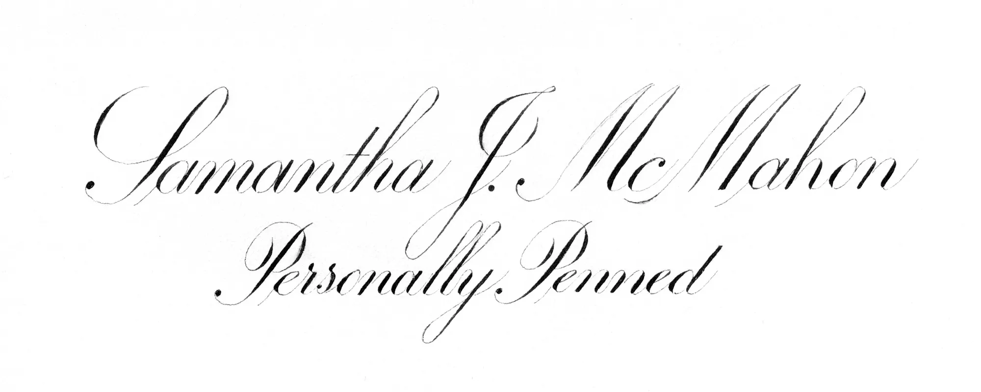
“Try to find a way to be happy with what you’re able to accomplish right now.”
“This piece of advice from David was a lesson very slowly learned, on this Name Plate journey. I really struggled with the fact that I couldn’t seem to get a reasonable copy done that I felt was of a level that I should be at, after having put so much time and effort into my studies.
Gradually I came to the understanding that I needed to accept that this is my level “right now” and look at “the small victories”.
Although it’s a little tight in a few places, I am reasonably happy with the spacing. My heft is somewhat consistent on the minuscules (‘lly’ is tight). Slant is fine. My tag line isn’t completely centred, but there is a visual idea of centre in my opinion due to the Majuscule S, on Samantha being larger, and the final n having no flourish. I made my Majuscules and entry strokes sit ever so slightly lower than the baseline to allow for my McM to flow.
For next time, I would like to adjust the heft of my Majuscules. My EQ’s (particularly on my PS#4’s) don’t have nice interior angularity. My retouching skills need practice (very evident in my first Majuscule P and my double L’s)
This project is something I look forward to revisiting after a couple of months (or even years) of practice. Fun Project all in all!”
Samantha McMahon – ES 2022 Dreamer
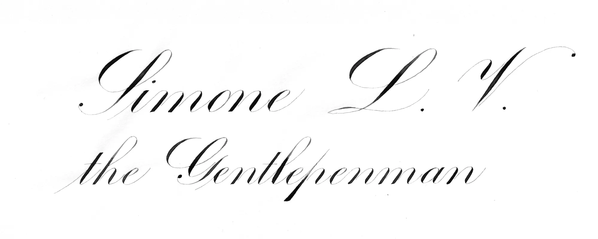
“In this nameplate I went through all the necessary steps to prepare a good layout; I mean all the tasks with pencil and ruler to adapt the script later. As soon as I realized I wanted to set three rows for my nameplate, I made some math to fit those rows in the given measures and so the layout came up. The second half of the process focused on how to typeset the text at different heights, trying out different combinations of scripts with and without flourishing components.
A special design note is the letterform of the lowercase letter P. I chose this form for its placement in the center of the word: I wanted it to evoke the idea of a wound, a gash, a knife cut that perfectly splits the entire word in two to better highlight the GENTLE-PENMAN pun.
In the end I opted for a non-overlapping arrangement between the ascending and descending spaces of the three lines with regard to a non-flourished text.
Once I completed this step, I carefully chose the optical composition rather than the physical centering. The main goal in my mind was to balance all the negative spaces around and in the middle of the text.
I hope I did this in an acceptable way because only the eyes of the beholder can give me real feedback about it. Unfortunately the final draft shows some errors here and there.
The most noticeable is the lowercase letter L in the main word “gentlepenman”… I exceeded in its heft, resulting in a non-consistent word compared to the rest.
Another component that I got wrong is the direct almond shapes in my two capital letters: S and L. They’re not very consistent in shape despite having a fair consistency in their heft.
Another nuance I got wrong is the synthetic shade I applied to the descending loop of the Y in the word MY. Finally I want to let you know that the whole project has not been retouched with knives or x-acto; just a few wet touches at some strokes, as you will see for yourself.
Thanks David for this great opportunity to study this fascinating subject with you! It makes me proud to be part of your school and very happy to share this precious journey with you and all my classmates!”
Simone Li Volsi – ES 2022 Dreamer
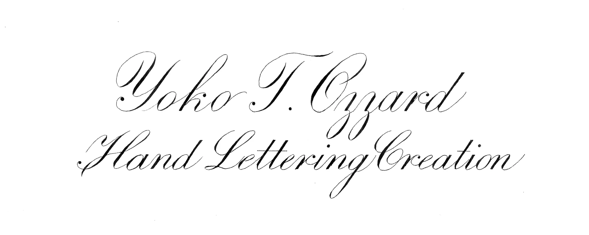
“What an amazing 4 months it was. I cherished each little session I was able to curve out at my desk for my journey. In the spirit of knowing we all have to start somewhere; I humbly submit this piece.
For my final attempt, I wanted to capture the beauty of Engrosserís Script; that is to me, an intricate balance between the high fidelity of the letterforms and the dynamics of the energy flow. I was highly charged up for this final project, and had a relatively steady hand until my pen caught the fibre at the upper stroke of the majuscule ëOí and spattered ink all over my paper. Shocking was an understatement and my immediate reaction was to re-do it right away. But part of me talked out of it and I decided to enjoy carrying on. I thought about keeping all those spattered ink dots as part of my design, but well, that didnít make it to the final. I scraped off every dot with my knife.
It sure is a memorable piece to me. I am very thankful to David for this precious experience and also to all the supportive friends in DIS community.”
Yoko Ozzard – ES 2022 Dreamer
View the Nameplate Specimens from 2021.